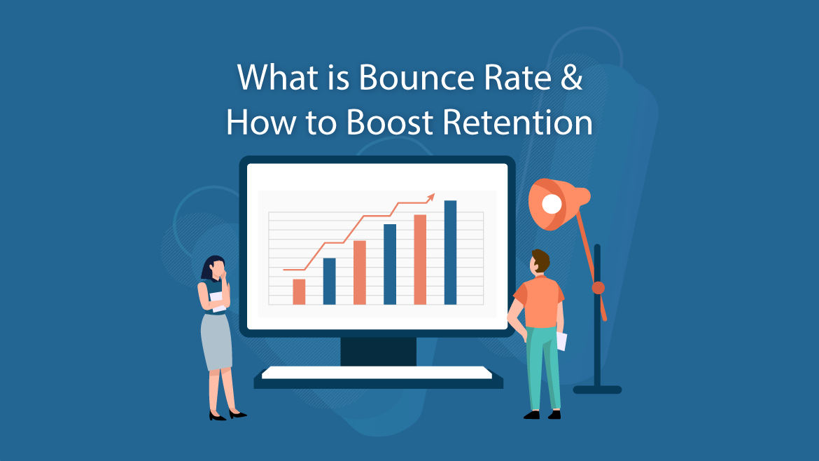
What is Bounce Rate? How to Boost Retention?

- What is Bounce Rate?
- How to Decrease Bounce Rates & Boost Retention?
- Website Functionality
- Website Design
- Marketing Tactics
Improving customer retention and decreasing website bounce rates is all about putting yourself in the visitor’s shoes. In other words, if you were a visitor to a particular website, what is it that improves your experience?
In order for any of this to be relevant, however, the consumer first needs to arrive on your website. This begins with general initial interest; what is it that you offer that applies to the consumer?
Once you attract them to your website, they need to be kept engaged. This is accomplished through flawless website functionality, design, and persuasion.
What that being said, what follows will be a discussion of bounce rates and retention rates. More specifically, we’ll clearly define what bounce rate is, how to decrease it, and thus, how to boost retention rates.
What is Bounce Rate?
Simply put, bounce rate is a term used to describe the success rate of traffic visitation. In other words, the rate (or time spent perusing) at which a visitor remains on your website before they leave.
Why is bounce rate so important to marketers and business owners alike? Because it’s a relevant performance indicator of your website and its content. It also acts as a tool of recognition; a way to identify flaws and/or strengths of your website.
So, bounce rates are important…great. However, how do you improve (or decrease) it? In other words, how do you boost website retention?
How to Decrease Bounce Rates & Boost Retention?
Decreasing bounce rates and boosting retention rates require a multifaceted, strategic, and technical approach; From website functionality and design to employed marketing tactics.
What follows will be a breakdown of nine (9) key indicators of bounce rates and retention rates. By focusing on improving each indicator, you’ll quickly begin to not only experience decreased bounce rates but increased retention rates.
- Ease-of-use
- Loading time & overall site speed
- Minimize friction (i.e. minimize steps to purchase)
- Website design & appeal
- Incorporate video
- Improve reader engagement
- Implement pop-up prompts
- Add call-to-actions throughout
- Customer support
Website Functionality
Ease-of-use
This simply refers to the functionality and accessibility of the website. Is the direction clear? Are the buttons obvious? When entering a website, you want to be able to navigate the entirety of the site almost subconsciously. In today’s technologically-driven society there is no room for error or difficulty.
Tip: It’s additionally notable to ensure that your website is mobile-friendly!
Website speed
We’ve all been on websites that are slow and delayed. What do you often do when this is the case? You usually leave and move on to the next website or resource, right?…
By increasing the speed and load-time of your website, you drastically improve customer retention. Things like oversized image files and inefficient hosting sites are what results in poor speed. The attention span is so minimal these days that you need to make your website speed a top priority.
Minimize steps to purchase
By reducing the number of steps it takes for someone to go from arrival to checkout, you increase customer satisfaction and retention rates. Any interruption or flaw in the process will impair the customer experience.
Website Design
Website appeal
An attractive website equates to an attracted visitor. Your website design is something that should be heavily invested in. Without a clean and professional look, the bounce rate of your website is likely to increase drastically.
Incorporate video
Adding video to your website is a great way to increase organic engagement. Video is generally easier to consume and faster to understand. It captures attention in ways that words can’t.
Adding video is a guaranteed way to keep customers on your website for longer.
Reader engagement
We as humans have very short attention spans. Moreover, our attention spans become even more reduced when we are reading. Large paragraphs and complex sentences & vocabulary create frustration and a lack of interest.
The result you want to accomplish is to make your content browsable. In other words, can a reader scan through the content in a matter of seconds and get the gist of the message? Or do they have to read word-for-word for minutes on end in order to gain an understanding of what you’re content is trying to convey?
Consider using engaging subheadings, bullet-points, shorter paragraphs (3 lines or less), and larger font sizes. This will ensure greater reader retention.
Marketing Tactics
Pop-up prompts
This is a fragile strategy, however, it can be effective if done right. Pop-ups are a great way to engage the website visitor in promotional material, email opt-ins, and more. But it can come across as annoying and “scammy” if they pop up too often. Timing and placement are key.
Call-to-action
Placing a call-to-action at the end of your content (video, blog, web copy, etc.) gives your website’s visitor a reason to stay and explore further.
Without proper call-to-actions, visitors tend to abandon the website immediately upon finding what they came for. A call-to-action will increase their duration of stay and potentially lead to a closed sale!
Customer support
Although customer support isn’t considered a marketing tactic by most, It indirectly plays a key role.
That role is mediating customer frustration and turning it into customer satisfaction. By troubleshooting and showing that you care and that you’re there to help, the customer is likely to stay on your website for a longer period of time.
It is also a slick way to gather and convert leads! Call it a 2-for-1…


