Is the 20% Rule Still Valid in 2023?

- What is Facebook’s 20% Text Rule?
- History of The Facebook 20% rule
- Use a Text Overlay Tool to Optimize the Text-to-Image Ratio
- How to Use the 20% Rule to Improve Your Ads?
In the world of digital marketing, Facebook has always been a top choice for advertisers to reach their audience. For a very long time, Facebook ads were restricted by a guideline known as the Facebook 20% rule which is about text overlay. But as we step into 2023, the big question is “Does this 20% rule for Facebook text overlay still matter?”. Let’s take a closer look at the history and significance of the 20% rule in today’s advertising landscape.
What is Facebook’s 20% Text Rule?
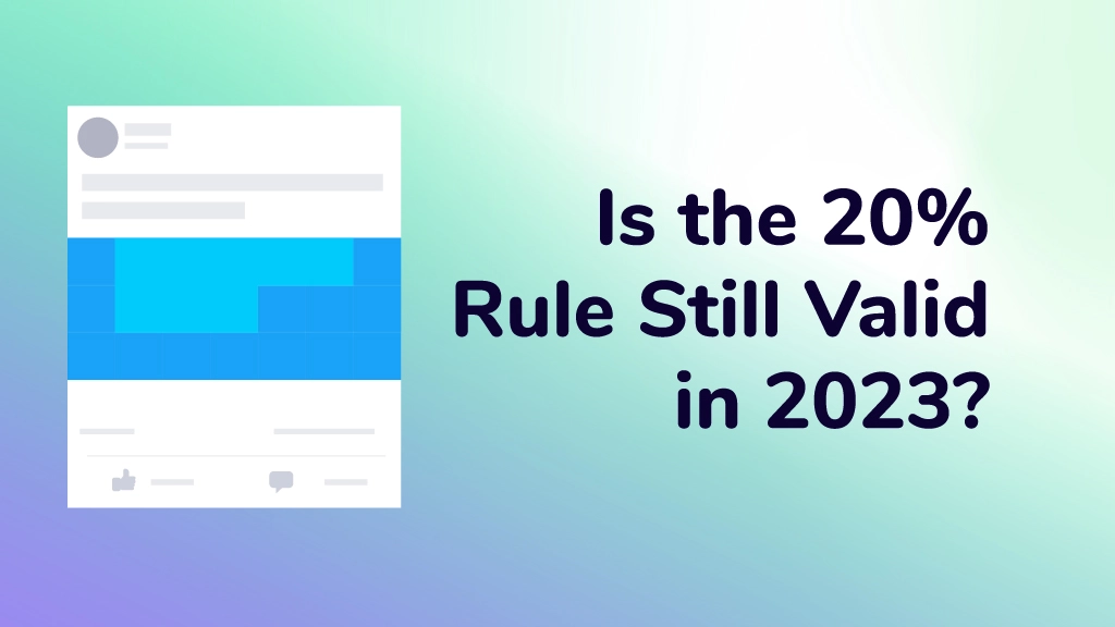
Before we dive into whether the Facebook 20% rule still matters, let’s understand what it is. Facebook’s advertising guidelines have included a rule that limits the amount of text in image or video ads. In simple terms, only 20% of the ad’s visual part can be text. If you go beyond this limit, your ad might reach fewer people.
The reason behind this rule is clear. Facebook wants ads to be visually engaging without overwhelming users with text. They want users to connect with friends and enjoy their social network; text-heavy ads can disrupt this experience.
History of The Facebook 20% rule
To understand the significance of the Facebook 20% rule, let’s take a brief journey back in time. Facebook introduced this ad text rule with the aim of maintaining a clean and visually engaging ad experience for its users. The main purpose was to prevent advertisers from overcrowding their ad images with text, ensuring that images and videos remained the center point.
Initially, Facebook was strict in implementing this Facebook ad text overlay rule, and ads that ignored it faced some consequences. However, over time, the platform’s approach evolved. In 2020, Facebook switched from completely rejecting incompatible ads to a more decent system, where such ads would experience reduced reach rather than being rejected directly.
Use a Text Overlay Tool to Optimize the Text-to-Image Ratio

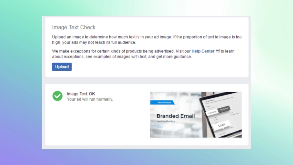
In the past, Facebook offered a handy tool, the “Text Overlay Tool,” to help advertisers make sure their ad creatives followed the 20% text rule. This tool allowed advertisers to check the balance between text and images in their ads, keeping them in line with Facebook’s guidelines.
However, it’s important to know that Facebook’s official Text Overlay Tool is no longer available. But alternatives are still around. While the official tool is gone, other tools can serve as your Facebook 20% rule checkers. These alternatives help ensure your ad meets the Facebook 20% rule.
These alternative text overlay tools offer a way to confirm that your ad’s text-to-image ratio aligns with the Facebook 20% rule. This way, you can maintain a balanced text-to-image ratio in your ad creatives, making sure your ads remain visually appealing, engaging, and in line with Facebook’s ad guidelines.
How to Use the 20% Rule to Improve Your Ads?
While Facebook is more tolerant about the 20% rule, using less text in your ad images can still lead to more engaging advertisements. In a world where user experience is essential, visually attractive, and less text-heavy ads tend to perform better. After Facebook removed the 20% Text Limit on Ad Images, the levels and limitations of ad images containing text are as follows;
Text ratio: None – The proportion of text in the ad is either absent or very low. (Suggested)
Text ratio: Low – A small limit is made on ad reach.
Text ratio: Medium – Ad reach is severely limited.
Text ratio: High – Ad reach is almost nonexistent.
Ways to Overcome the Facebook Ads 20% Text Rule

We’ve learned all about Facebook Text Overlay. If you’re worried about complying with the 20% rule while telling your message effectively, there are strategies to help you overcome this challenge. Here are some tips to strike the right balance;
Keep It Short: The key to staying within the 20% text limit is to keep your text short and to the point. Think of it as crafting a compelling headline that instantly grabs the user’s attention. Use brief language that expresses your message effectively without the need for a lot of words.
Use Headlines and Descriptions: Remember that your ad isn’t just about the image. Take advantage of the ad headline and description sections to provide additional context and information without crowding the visual component of your ad. These spaces are perfect for expressing essential details and engaging with users without relying on heavy text in the image.
Try Carousel Ads: Instead of trying to fit all your information into a single image, consider using carousel ads to tell a more comprehensive story. Each image within the carousel can contain its text, allowing you to deliver a well-rounded message without violating the Facebook 20% rule. This approach is particularly effective for product showcases, step-by-step guides, or storytelling.
A/B Testing: A/B testing involves creating multiple ad variations with different text-to-image ratios. By doing so, you can analyze which ratio resonates most with your target audience. Test different approaches, and use data-driven insights to fine-tune your ads for the best performance.
In conclusion, even though the 20% text rule has become more relaxed, it’s not entirely irrelevant in 2023. Getting the right balance between text and visuals is the key to creating compelling ads. By using alternative text overlay tools and following best practices, you can make sure that your ads not only meet the rule but also deliver excellent results.


This is one awesome article post.Really thank you! Really Great.
Hey there J, thanks for your kindness!
Major thanks for the blog article.Much thanks again. Keep writing.
Thanks Bernardo, stay tuned!