Facebook Ad Design Tips
- 1. Limit the amount of text
- 2. Simple font styles for readability
- 3. Use contrast to attract attention
- 4. Ad placement design
- 5. Micro targeting
- 6. Examine various ads
- 7. Select the ideal formats
- 8. Use a tried-and-true method
- 9. Design for your ad goals
- 10. Brand connections
A strong Facebook ad will go a long way toward increasing traffic, brand exposure, and sales. But occasionally, designing a Facebook ad might be difficult. When designing an ad, there are numerous factors to take into account, including the location of the ads as well as its size, photos, composition, style, and fonts. How would you determine what is effective and what is not? Or what will distinguish your company or your product?
Take a look at our Facebook ad design recommendations to get the most out of your ads if you’re new to Facebook ads or want to improve your ads.
1. Limit the amount of text

Keep your ad copy brief, taking into account that your audience want to spend as little time as possible viewing ads. It is essential to keep your message under 280 characters in order to convey it as swiftly and clearly as possible. It is preferable to be upfront and transparent when you have their attention because many users will ignore your post as soon as they learn it’s an ad.
Don’t try to jam a bunch of offers or value propositions into one ad; instead, keep your attention on just one message. Ideally, the message should present an offer (such as, ‘’50% off jeans this weekend’’), a promotional event (such as, ‘’now launching a new location’’), or a specific value proposition (such as, ‘’free shipping on all orders’’).
Save any more information for once they have clicked the CTA. The user can get all of that additional information on your website, app, or product page, depending on where your ads direct them.
2. Simple font styles for readability

You want your text to be brief and to the point, but you also want it to be easy on the eyes. Make your ad copy easy to read by using straightforward font styles. Flashy, ornamental fonts may get some attention, but they will likely detract from your main point and make it harder for the reader to understand.
It is ideal to use bold, sans-serif fonts. To ensure that texts that is overlaid on top of images is still readable, it should be thick and stand out from the background with a distinct color. When you discover a font you like, use it consistently. Limit yourself to using no more than one or two fonts as using more than that can be distracting.
3. Use contrast to attract attention

With a constant stream of current events, wholesome feel-good stories, and news, social media is a crazy circus of weirdness and difference. That is who or what your Facebook ads are up against in the attention stakes.
Use visual tricks such as contrasting to draw viewers’ attention in order to get your ads read, much alone viewed. Using two colors that are next to each other on the color chart is one of the most fundamental contrast strategies that anyone may employ. Contrasting colors, such as black/white, blue/yellow, or red/green, naturally bring out the best and increase the text’s, color’s, and image’s visibility.
4. Ad placement design
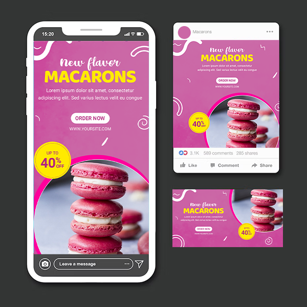
The major three places where Facebook ads can be seen are the right column, mobile feed, and desktop feed, each with their own sizes and advantages. While it may be tempting to create one ad and modify it to fit different spaces, doing so will ultimately harm the ad’s performance.
Study the Facebook usage patterns of your target market first. Do they use it on their phones or desktops? You can optimize your ads for mobile, for instance, if the majority of your target audience uses Facebook on a mobile device. Facebook ads particularly benefits from this kind of effective simplification because it allows you to make the most of your ad budget.
5. Micro targeting
The pinpoint accuracy of Facebook ads’ client targeting is one of its best qualities. You may hand-craft ads campaign to appeal to very particular types of audience by using micro targeting because Facebook is essentially a database of people’s hobbies, jobs, locations, and life events.
Making the most of micro targeting is one of our top recommendations for Facebook ad design. Facebook ads, in contrast to more generic ads in mainstream media, can be custom-made for even the smallest niche, taking advantage of their distinct tastes. For the demographic you want to attract customize the picture, copy, tone, color scheme and even the things you’re promoting.
When this method is based on actual user data, it becomes much more effective. You can optimize your Facebook ads for all the factors, especially with split tests, instead of using the same generic ads for both market sectors, you can build unique ads for each.
6. Examine various ads
The initial stages of Facebook ads, or digital ads in general, involve a lot of ‘’shooting in the dark.’’ There are no assurances in ad campaigns until you can actually see them in actions even with solid user data.
The best course of action is to adjust your strategy as you go along, enhancing and updating your ads based on how the prior ones performed. You can test numerous ads simultaneously to discover wha works and what doesn’t in order to cast a wider net.
You can evaluate your brand’s performance in a new market in addition to testing the effectiveness of your Facebook ad design. With a targeted Facebook ad, you can test the waters before spending more money if you’re considering expanding into a new market or trying out a new product line.
7. Select the ideal formats
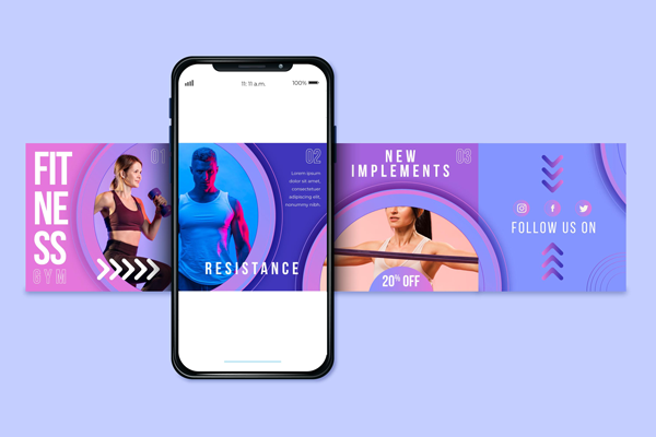
The format of your Facebook ads, such as a video static picture, carousel, etc., should be optimized. Additionally, some businesses can employ specific formats more effectively than others. The various formats appeal to various customer groups. A retailer, rather than a SaaS provider, can use Collection Ads to highlight their product selection.
The following are your Facebook ad format options:
- Image ads consist of a single still image with no animation. This is a fantastic approach to rapidly produce a straightforward and effective ads that’ll direct visitors to your website and increase awareness of your company and products.
- Video ads are a short clips with audio. Using a combination of image, text, sound, and motion, these ads can assist your company and product in creating an interesting film. It works wonders to get people interested in your brand.
- Collection ads are a set of identical thumbnail images that can promote qualities of one particular product, display several products at once, or walk the viewer through a procedure.
- Carousel ads are a set of single images presented inside one single ad. There will be a link for every photograph. This style works well for showing off several products, highlighting the aspects of your products, making a look book for your product, and sharing your brand’s history.
- Stories ads are in a full screen vertical style and can be either video or image based. They are brief, interesting, and interactive. It’s a powerful format for making inclusive, sincere connections with your audience.
Also, don’t be afraid to mix and match various formats within the same campaign; for instance, including some video ads in a static-image-only campaign can increase conversions by 17%.
8. Use a tried-and-true method
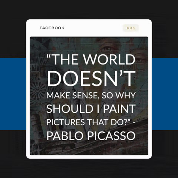
The finest advise for designing Facebook ads occasionally comes from conventional ads. Standard ads best practices may not be possible to follow exactly, but with a few adjustments, you can adapt them to Facebook.
One of the most obvious changes in ads, for instance, is format. The traditional ads landscape lost significance as individuals increasingly consumed material on their mobile phones. Product-focused creativity is one tried-and-true ads tactic that continues to be effective despite the format change. It can help to achieve business success when your creative materials have a clear message and focal point. According to Facebook, creatives with a clear product emphasis received 71% more views for their content than those without one.
9. Design for your ad goals
This advice for creating Facebook ads has two purposes. The first is the literal interpretation: create your Facebook ad to advance your specific objective, whether it is more general, like raising Facebook brand awareness , or more focused, like selling a certain product. That is sound marketing advice for any platform.
The second aspect is unique to Facebook: one of the fields you use when creating a Facebook ad is ad objectives. You can choose from the following:
Users fill up forms with their name, email, phone, etc. to generate more leads. Gain more website traffic through ad clicks that direct users to your page Promote your company locally; only those within a 2 to 50 mile radius will see your ad. Promote your event by either getting the word out or by selling tickets directly.
Your ultimate objective should inform every aspect of your Facebook ad design, particularly the CTA. Mention a reward for completing the form, for instance, if your objective is to generate more leads. If you’re promoting a local business, include some locals-friendly keywords, such as a well-known dish or sports team.
10. Brand connections
Your Facebook ads should appear and feel like they represent the personality of your brand. To begin with, your Facebook ad design should always incorporate the fundamentals of branding are logo, color theme, branded fonts, key services/products and mascots.
However, Facebook ad design should use all aspects of visual identity in branding, just like the rest of your visual material. These details, such as the fonts to use and the colors that evoke the feelings you want viewers to connect with your brand, should be worked out early on in the development of your business model.




I really liked your article.Really looking forward to read more. Really Cool.
Thanks Celina, stay tuned!
Im thankful for the article post.Thanks Again. Keep writing.
Thanks Celina, stay tuned!